Field Studio LA
,
Brand, Website
,
2026
Field Studio Landscape Architects is a Bozeman practice shaping land with the patience of a naturalist, designing in the space between the drawn line and the living landscape. Their studio grew from the pages of a naturalist’s handbook: close observation, field notes, a deep respect for place. The refreshed identity holds a quiet tension between structure and nature. A mountain silhouette, split in two, balances precision with softness, while a wordmark of typewriter-like restraint and a palette drawn from the valley itself keep everything earthy, contemporary, and considered. A brand and digital presence grounded in the land, yet refined.

[01]

[02]

[03]

[04]

[website coming soon]
Field Studio LA
,
Brand, Website
,
2026
Field Studio Landscape Architects is a Bozeman practice shaping land with the patience of a naturalist, designing in the space between the drawn line and the living landscape. Their studio grew from the pages of a naturalist’s handbook: close observation, field notes, a deep respect for place. The refreshed identity holds a quiet tension between structure and nature. A mountain silhouette, split in two, balances precision with softness, while a wordmark of typewriter-like restraint and a palette drawn from the valley itself keep everything earthy, contemporary, and considered. A brand and digital presence grounded in the land, yet refined.
[01]
[02]
[03]
[04]
[website coming soon]
ITI Stays
,
Brand, Website, Photography
,
2026
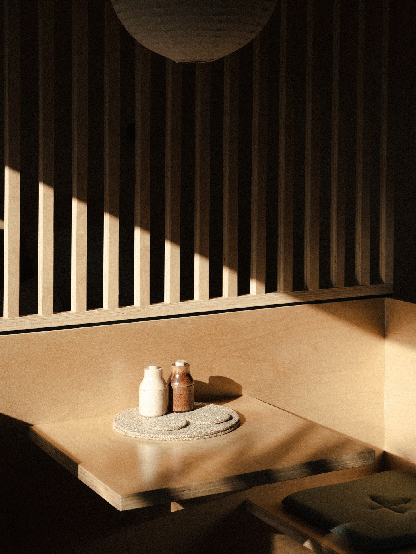
ITI is a design-led stay in Raglan, created for those seeking both landscape and stillness. Rooted in architecture and natural materiality, the brand reflects a space to arrive, settle, and unwind after time spent outdoors. The identity draws from the concepts of arrival and solitude, shaping a calm, intentional experience. A modular mark, derived from the i–T–i letterforms, is informed by architectural grid systems and softened by rounded forms to balance structure with warmth. Paired with a refined serif wordmark, the brand system feels timeless and considered: architectural in foundation, yet inherently human.

[01]

[02]

[03]

[04]
[05]

[06]
ITI Stays
,
Brand, Website, Photography
,
2026
ITI is a design-led stay in Raglan, created for those seeking both landscape and stillness. Rooted in architecture and natural materiality, the brand reflects a space to arrive, settle, and unwind after time spent outdoors. The identity draws from the concepts of arrival and solitude, shaping a calm, intentional experience. A modular mark, derived from the i–T–i letterforms, is informed by architectural grid systems and softened by rounded forms to balance structure with warmth. Paired with a refined serif wordmark, the brand system feels timeless and considered: architectural in foundation, yet inherently human.
[01]
[02]
[03]
[04]
[05]
[06]
Juno Gerlach
,
Visual Identity
,
2026
A debut album cover for Wānaka singer-songwriter Juno Gerlach. Juno writes about love in full: falling into it, losing it, and everything in between. For her debut album Alamort, we built a visual world that felt as cinematic and confessional as the songs themselves. The cover grew from a mirror ball, and the idea of taking the broken pieces of yourself to create something beautiful. Juno’s portrait is glimpsed through shards cut into a dusty pink sleeve, like fragments of a broken mirror. You catch an eye, a hand, a mouth, but never the whole picture. A handwritten script carries the title across the middle, while a scrapbook feel pulled from the ’70s and ’90s keeps it nostalgic, warm and a touch unfinished.

[01]

[02]

[03]

Juno Gerlach
,
Visual Identity
,
2026
A debut album cover for Wānaka singer-songwriter Juno Gerlach. Juno writes about love in full: falling into it, losing it, and everything in between. For her debut album Alamort, we built a visual world that felt as cinematic and confessional as the songs themselves. The cover grew from a mirror ball, and the idea of taking the broken pieces of yourself to create something beautiful. Juno’s portrait is glimpsed through shards cut into a dusty pink sleeve, like fragments of a broken mirror. You catch an eye, a hand, a mouth, but never the whole picture. A handwritten script carries the title across the middle, while a scrapbook feel pulled from the ’70s and ’90s keeps it nostalgic, warm and a touch unfinished.
[01]
[02]
[03]
HR Oyster Shed
,
Website
,
2025
Hawkesbury River Oyster Shed is a waterfront dining experience, known for its relaxed atmosphere and strong connection to place. As the business grew in popularity, the existing website no longer reflected the quality of the experience or supported the evolving needs of the brand. The new site was built on Shopify, integrating seamlessly with the booking platform and Square-based retail system to support online ordering, reservations, and the sale of tours, merchandise, and gift cards. A strong focus was placed on refining the customer journey, with navigation and user flows shaped through iterative testing to ensure a smooth, intuitive experience. Features such as an integrated chat function reduce friction for customers, while the flexible backend allows the family-run business to easily manage and grow the site as it continues to evolve.

[01]

[02]

[03]

[04]

[05]
HR Oyster Shed
,
Website
,
2025
Hawkesbury River Oyster Shed is a waterfront dining experience, known for its relaxed atmosphere and strong connection to place. As the business grew in popularity, the existing website no longer reflected the quality of the experience or supported the evolving needs of the brand. The new site was built on Shopify, integrating seamlessly with the booking platform and Square-based retail system to support online ordering, reservations, and the sale of tours, merchandise, and gift cards. A strong focus was placed on refining the customer journey, with navigation and user flows shaped through iterative testing to ensure a smooth, intuitive experience. Features such as an integrated chat function reduce friction for customers, while the flexible backend allows the family-run business to easily manage and grow the site as it continues to evolve.
[01]
[02]
[03]
[04]
[05]
Soland
,
Brand
,
2025
Soland is a conceptual brand exploring the intersection of trail running and community-led outdoor culture. Designed for the modern outdoor enthusiast, it centres around shared movement: bringing people together through events, gatherings and experiences rooted in natural landscapes. The name combines Sol (sun/soul) and Land (earth/terrain), reflecting both the environments we move through and the collective energy that forms around them. This idea is carried through the logomark: two feet converging into an ‘S’, symbolising connection in motion – endurance and community, grounding and momentum.

[01]

[02]

[03]

[04]
Soland
,
Brand
,
2025
Soland is a conceptual brand exploring the intersection of trail running and community-led outdoor culture. Designed for the modern outdoor enthusiast, it centres around shared movement: bringing people together through events, gatherings and experiences rooted in natural landscapes. The name combines Sol (sun/soul) and Land (earth/terrain), reflecting both the environments we move through and the collective energy that forms around them. This idea is carried through the logomark: two feet converging into an ‘S’, symbolising connection in motion – endurance and community, grounding and momentum.
[01]
[02]
[03]
[04]
Assembly Four
,
Website Development
,
2025
Assembly Four is a collective of sex workers and technologists building technology for, and with, the communities it serves. With the brand identity designed by For The People, we led the website development. Built on WordPress, the site brings the design to life with considered, scroll-based motion and custom interactive components. Accessibility shaped the build throughout, from a motion on/off toggle to keyboard-friendly navigation, while a fully responsive approach ensures the experience holds across every screen.

[01]
[02]

[03]

[04]
[05]

[06]
Assembly Four
,
Website Development
,
2025
Assembly Four is a collective of sex workers and technologists building technology for, and with, the communities it serves. With the brand identity designed by For The People, we led the website development. Built on WordPress, the site brings the design to life with considered, scroll-based motion and custom interactive components. Accessibility shaped the build throughout, from a motion on/off toggle to keyboard-friendly navigation, while a fully responsive approach ensures the experience holds across every screen.
[01]
[02]
[03]
[04]
[05]
[06]